

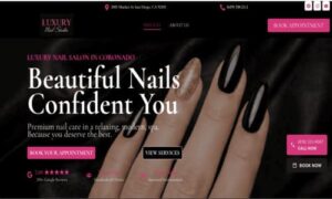
A beautiful nail salon can lose clients before they even walk through the door — because of its website.
Today, nail salon website design plays a critical role in whether a visitor becomes a booking or leaves within seconds. If a site feels broken, slow, or confusing, people don’t try to figure it out — they leave.
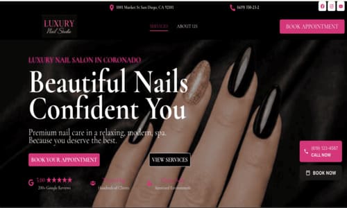
In this breakdown, I’ll show a real example of a salon website that struggles with layout, usability, and mobile experience.
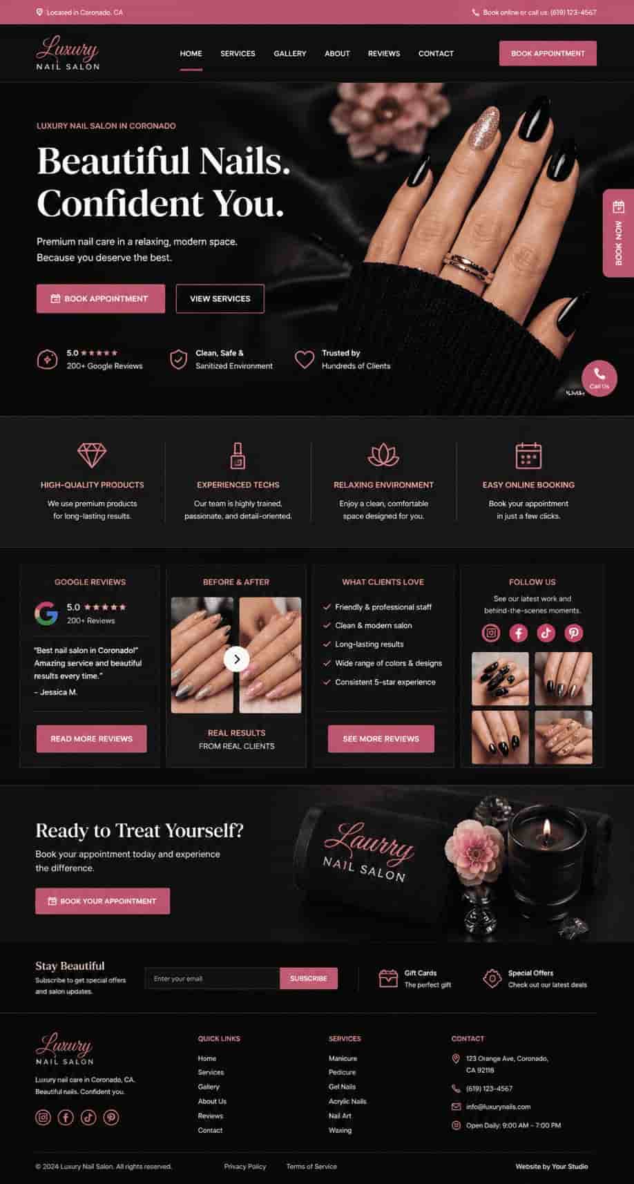
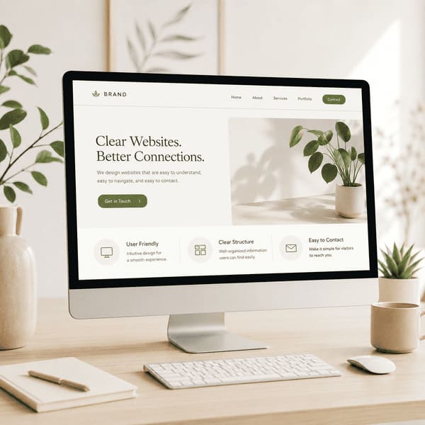
🔥 At the end, I’ll also share two redesigned versions to show how the same website could look with a clear structure, stronger messaging, and a more effective booking flow.
First Impression: What Happens When You Land on This Website
At first glance, the website looks visually appealing — dark theme, stylish imagery, and a modern aesthetic.
But within seconds, something feels off.
The layout lacks structure, important elements compete for attention, and the overall experience feels unstable — especially on mobile devices.
Instead of guiding the visitor toward booking an appointment, the page creates confusion and friction.
And in today’s market, confusion means one thing: lost clients.

Common Nail Salon Website Design Mistake #1: No Clear Headline or Value Proposition
One of the biggest issues on this website is the lack of a clear headline.
When a visitor lands on the page, it’s not immediately obvious what makes this nail salon different — or why they should choose it over competitors.
The phrase “At your fingertips” may sound elegant, but it doesn’t communicate any real value. It doesn’t tell the user what services are offered, what the pricing level is, or what kind of experience they can expect.
In high-conversion websites, the first screen should answer three simple questions within seconds:
• What is this business?
• Who is it for?
• Why should I choose it?
Right now, the website doesn’t clearly answer any of these.
As a result, users are forced to “figure it out” on their own — and most won’t. They will simply leave and choose a competitor with a clearer message.
✔ What should be here instead:
A strong, clear headline such as:
“Luxury Nail Salon in Coronado – Book Your Appointment Today”supported by a short subheading that highlights key benefits.
Common Nail Salon Website Design Mistake #2: Visual Overload and Lack of Structure
This is another common issue that directly affects how users interact with a website.
Another major issue is visual overload.
The homepage tries to present too many elements at once — multiple sections, images, buttons, and text blocks all compete for attention without a clear hierarchy.
Instead of guiding the user, the layout creates noise.
There’s no clear flow from one section to another. The eye doesn’t know where to go first, what to focus on, or what action to take next.
Multiple sections use similar styles and colors, which makes everything blend together instead of standing out.
Important elements like buttons don’t attract enough attention, and content blocks feel disconnected.
As a result, users don’t experience the website as a clear journey — but as a collection of unrelated pieces.
And when a website feels overwhelming, users don’t try to understand it — they leave.
✔ What should be happening instead:
A well-structured homepage should guide the user step by step:
• Clear hero section
• Simple service overview
• Trust elements (reviews, photos)
• Strong call-to-action
Each section should lead the visitor closer to booking.
Website Design Mistake #3: Weak or Ineffective Call-to-Action (CTA)
This is one of the most critical elements of any service-based website — and one of the easiest to get wrong.
A website can look visually appealing, but if it doesn’t clearly guide users toward taking action, it won’t generate bookings.
On this website, the call-to-action — such as “Book Now” — exists, but it lacks visibility, clarity, and urgency.
It doesn’t stand out enough from the rest of the design, and it doesn’t communicate a compelling reason to click.
Users are not being guided or encouraged — they are left to decide on their own.
In reality, most visitors don’t take initiative. They need direction.
A strong CTA should answer a simple question:
What should I do next?
Right now, that answer is not clear.
As a result, even interested visitors may leave without booking — simply because they were not prompted effectively.
✔ What should be happening instead:
A high-converting nail salon website uses clear and visible calls-to-action:
• A prominent “Book Appointment” button in the hero section
• Sticky mobile button for quick booking or calling
• Repeated CTA throughout the page
• Action-driven wording (not just “Book Now,” but “Book Your Nail Appointment Today”)
The goal is simple: make the next step obvious and effortless.
💡 Even a small improvement in CTA visibility can significantly increase bookings without changing anything else on the website.
Common Nail Salon Website Design Mistake #4: Poor Mobile Experience
This is one of the most critical issues for any local service business today.
Most users today visit nail salon websites from their phones — often while searching for a place to book quickly.
On this website, the mobile experience feels unstable and difficult to use.
Elements appear misaligned, sections don’t adapt properly to smaller screens, and the layout loses its structure.
Instead of a smooth scrolling experience, the page feels inconsistent and hard to navigate.
Important actions — like booking or calling — are not always easy to find or access.
This creates friction at the exact moment when users are ready to take action.
And on mobile, friction means abandonment.
Users won’t try to fix the experience — they will simply go back and choose another salon with a cleaner, easier website.
✔ What should be happening instead:
A mobile-friendly website should feel simple, fast, and intuitive:
• Clean vertical layout with clear spacing
• Easy-to-tap buttons
• Sticky “Call” or “Book” button
• Fast loading speed
• No broken or overlapping elements
The goal is to make booking possible in just a few taps.
💡 For local businesses, mobile experience is often more important than desktop — because that’s where most bookings happen.
Common Nail Salon Website Design Mistake #5: Broken Functionality and User Confusion
Even small technical issues can have a direct impact on bookings — especially when they affect core actions like calling or scheduling.
Beyond design and layout, this website has several functionality issues that directly affect usability.
Contact elements — such as phone numbers and social media icons — appear on the page, but they are not clickable.
For a mobile user, this is a major problem. Instead of tapping to call, they are forced to copy the number manually or leave the site altogether.
The footer also creates confusion. Important elements appear oversized and poorly structured, making the bottom of the page feel cluttered and unprofessional.
Another critical issue happens during the booking process.
When a user clicks “Book Now,” they are redirected to a booking page — but visually, it looks almost identical to the homepage.
Because the first section (hero banner) is nearly the same, users may not realize that the page has changed.
As a result, they click “Book Now” again, expecting something to happen — which creates confusion and frustration.
Instead of a clear booking flow, the experience feels repetitive and unclear.
Even though the website technically works, the user experience breaks at the exact moment when a booking should happen.
✔ What should be happening instead:
A functional, conversion-focused website should remove friction at every step:
• Clickable phone number (tap-to-call)
• Active and properly linked social media icons
• Clean, structured footer with clear information hierarchy
• A clearly different booking page (visual change, new headline, clear context)
• Smooth and obvious transition from browsing to bookingThe user should always know where they are — and what to do next.
💥 When users get confused at the booking stage, it doesn’t just affect user experience — it directly costs real clients.
Common Nail Salon Website Design Mistake #6: Lack of Trust and Social Proof
Even if the design and functionality were improved, this issue alone can still prevent users from booking.When someone visits a nail salon website, they are not just looking at services — they are deciding whether they can trust the business.
On this website, there is very little that builds confidence or reassures the visitor.
There are no strong client reviews, no visible ratings, and no clear proof of real customer experience.
Without these elements, the website feels incomplete.
A new visitor has no reason to believe the quality is high, the service is consistent, or the results will match expectations.
In local service businesses, trust is often the deciding factor.
If a competing salon shows real reviews, before-and-after results, or even simple testimonials — they will win the client.
Even if this salon provides excellent service in reality, the website does not communicate that.
✔ What should be happening instead:
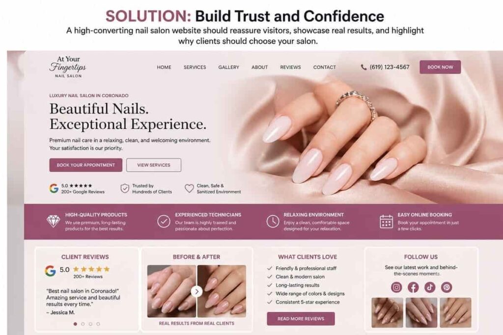
A high-converting nail salon website should actively build trust:
• Google reviews or rating badges
• Before-and-after photos of real work
• Short client testimonials
• Clear photos of the salon interior
• “Why choose us” section with real benefits
These elements help reduce hesitation and make the decision easier.
💥 People don’t book based on design alone — they book when they feel confident in their choice.
Common Nail Salon Website Design Mistake #7: Poor Search Visibility (SEO Issues)
Even a well-designed website won’t bring clients if people can’t find it.
Beyond design and user experience, this website also struggles with basic SEO fundamentals.
Key elements such as meta descriptions, structured headings, and keyword optimization are either missing or not properly implemented.
This makes it harder for the website to appear in search results when potential clients are looking for services like “nail salon near me” or “nail salon in Coronado.”
In today’s market, visibility is just as important as design.
If a website is not optimized for search engines, it relies entirely on direct traffic — which significantly limits growth.
Even a small improvement in SEO can increase organic traffic and bring in new clients without additional advertising costs.
✔ What should be happening instead:
A strong nail salon website should include:
• Clear H1 and heading structure
• Optimized meta title and description
• Location-based keywords
• Fast loading speed
• Proper indexing and technical setup
These elements help the website appear in search results and attract new visitors consistently.
💥 A beautiful website that no one can find will never generate consistent bookings.
Summary
A nail salon website doesn’t need to be complex — but it must be clear, functional, and focused on guiding users toward booking.
In this case, the main issues come down to:
• Unclear messaging
• Lack of structure
• Weak calls-to-action
• Poor user experience
• Missing trust elements
• Limited visibility in search
Each of these problems may seem small on its own — but together, they create friction that drives potential clients away.
The good news is that these issues are fixable.
With the right approach, the same website can become a consistent source of new bookings — not just an online presence.
In many cases, it’s not the business that needs improvement — it’s how the business is presented online.
How I Would Redesign This Website
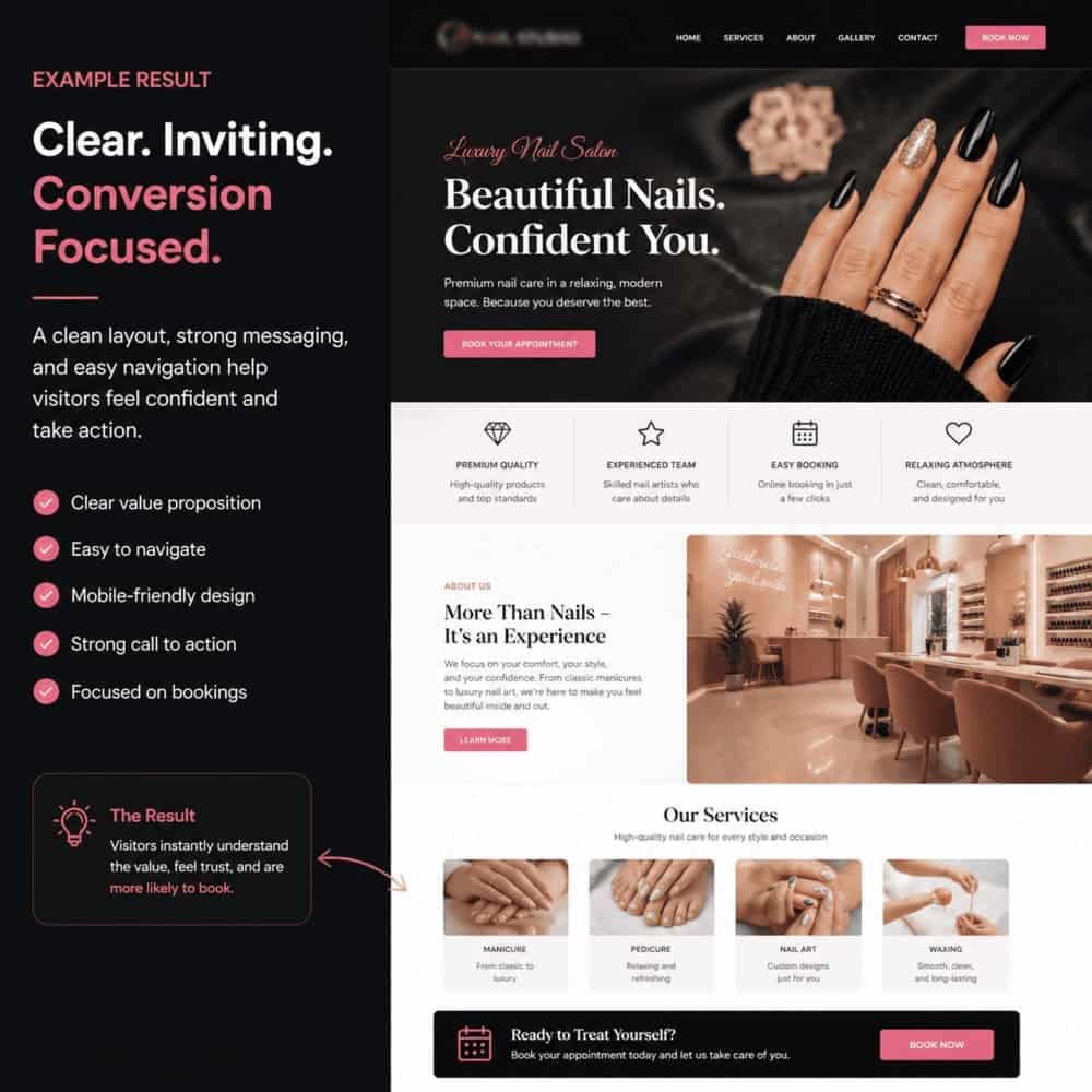
Based on the issues identified above, the goal of the redesign would be simple: make the website clear, structured, and focused on converting visitors into bookings.
💡 The result would not just be a better-looking website — but a system that helps turn visitors into real clients.
Users would immediately understand the value, feel confident in their choice, and move naturally toward booking an appointment.
Instead of overwhelming users, the layout should guide them step by step — from first impression to final action.
🔥 I’ve also created 2 visual examples of how this website could look after these improvements — showing a cleaner layout, stronger messaging, and a more effective booking flow.
I also offer a professional website redesign service focused on improving trust, user experience, and conversions for small businesses.
If you’d like to see a version tailored specifically to your salon, I’d be happy to share it.
Example #1
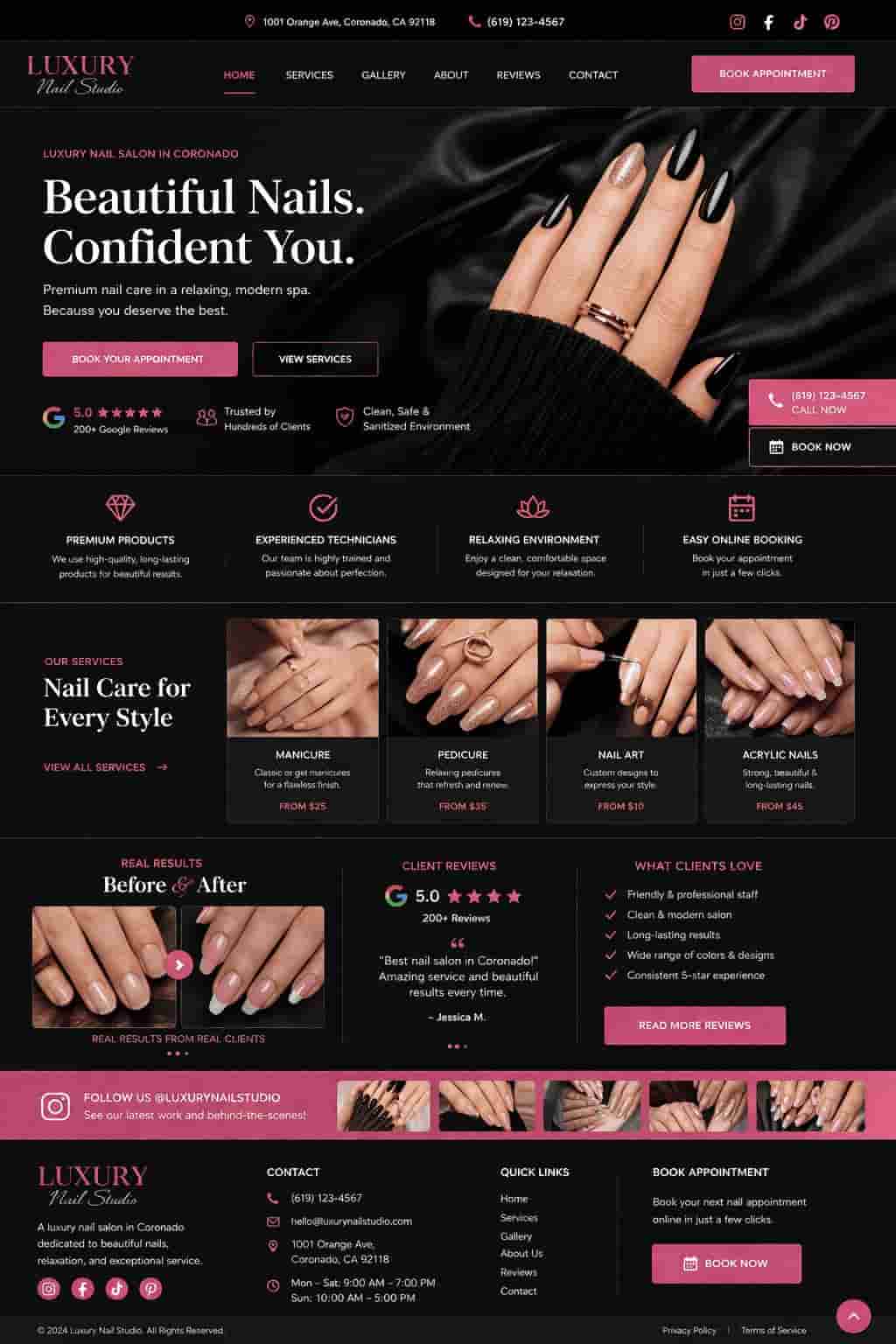
Example #2