

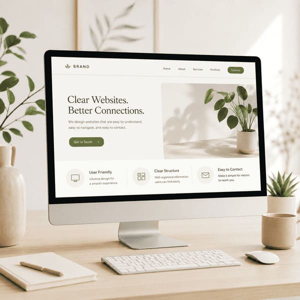
User-friendly website design for small business starts with one simple principle: visitors should immediately understand what your company does, who you help, and how they can contact you.
Have you ever opened a business website and, after several seconds, still could not understand what the company actually offers?
You scroll down. A video starts playing. Text appears and disappears. Images move across the screen. Several buttons compete for your attention. There are impressive effects everywhere—but you still do not know what service is being offered, where the company works, or how to contact someone.
This happens far more often than it should.
At the opposite extreme, some websites look as though they have not been updated in fifteen years. The text runs outside the page, sections do not display correctly on mobile devices, important information is buried somewhere in the menu, and the contact form barely works.
Both situations create the same problem:
The visitor becomes confused and leaves.
A website should not make people work to understand your business. It should make their decision easier.
Why User-Friendly Website Design for Small Business Matters
Most visitors do not come to your website simply to admire its design. They arrive because they need a service, have a problem, or want to compare your company with other options.
They want to quickly understand:
Do you provide the service I need?
Do you work in my area?
Can I trust you?
How can I contact you?
A user-friendly small business website answers these questions without making the visitor search through multiple pages, watch long videos, or decode vague marketing phrases.
A Beautiful Website Is Not Always an Effective Website
I create websites, work with SEO, manage advertising, and run a local service business myself. Because of that, I look at websites from two different perspectives: as a web professional and as a potential customer.
And honestly, many websites are designed to impress other designers—not to help real customers.